Kernel Density Estimation
1 min read
KDE plots are great for looking at distributions.
These are my favorite settings with seaborn for making KDE plots. Substitute data with your own dataset. Adjust bins based on your data. I usually adjust bins to a tenth of the data volume, but you can make it even more granular by increasing the bin count.
import matplotlib.pyplot as plt
import seaborn as sns
import numpy as np

points = 500
data = np.random.normal(0, 0.5, points)

sns.histplot(data,
             bins=int(points/10),
             color = 'darkblue',
             kde=True
             )

plt.savefig('hist.png')
return('hist.png')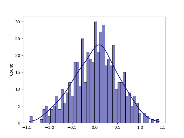
Update 2023: